
The boardroom is no place for ambiguity. In our experience at StellarEcho AI, we have seen billion-dollar decisions stalled by cluttered charts and misleading scales. Bad charts ruin good data by obscuring the truth and wasting the most valuable resource an executive has: time.
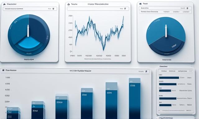
1. Matching Chart Types to Data Narrative
Choosing the wrong chart is like communicating in the wrong language. Executives need to know the 'What' and 'So What' instantly.
- Line Charts: For trends over time.
- Bar Charts: For categorical comparisons.
- Waterfall Charts: For financial bridges.
Diagram: Comparison Logic
2. The Executive Eye & Color Theory
Color should never be used solely for decoration. In a high-tech dashboard, color is a semantic layer. Use a neutral palette (grays and navy) and Reserve vibrant accents like StellarEcho Cyan for things that require immediate action or represent the primary KPI.
3. Optimizing the Data-to-Ink Ratio
Inspired by Edward Tufte, our automation services focus on removing 'chart junk'. Grids, borders, and unnecessary 3D effects should be stripped away. If a pixel doesn't carry new information, it shouldn't exist on your executive screen.
"Clarity is not a goal; it is a requirement for survival in the data age."
4. Contextualizing with Baselines
A revenue figure of $1.2M is meaningless without context. Is that up 10%? Is it 20% below the historical average for Q3? We always embed historical benchmarks and target lines to provide instant cognitive orientation.
Transform Data into Strategy
At StellarEcho AI, we don't just build dashboards; we orchestrate data narratives. Contact us to see how we can automate your internal reporting into a precise, forward-thinking visualization suite.
Request a Visual Audit